Building new things and enabling products to deliver better experiences to users is the things that makes development compelling for me. This surprisingly leads me to think about testing a lot. Testing enables changes to happen sustainably. With tests I have confidence that the existing product works as expected and guarantees that this doesn’t change as new values are added. The more time I need to manually validate, the less time I have to do the work I enjoy.
As a visual learner, I prefer to work with my eyes to see how things work and visualization help me understand complex things… like tests. I’ve been creeping on automated Visual Regression Testing (Visual Testing) for a while now. It visually finds the differences between two different versions of a web app or site. It looks really obvious when it finds things that might normally be hard to see:
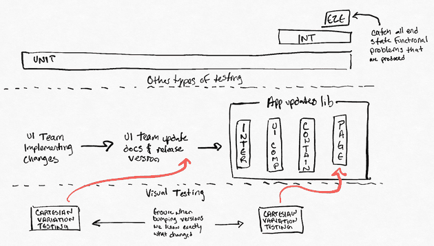
A UI library project I work with releases regularly with good semantic versioning, release notes, unit testing and manual testing. Occasionally, even with all of this in place, they still unexpectedly break our application. Some of their changes have unintended visual changes because we combine components together in previously unplanned ways. When we upgrade we’re having to go through all of the visual work we’ve done to check if something unexpected happened visually.
While I really want to use this cool tool, I also want to keep the impact of my change on development process low, using as much of the existing flow as possible. It would be awesome to get something simple that could tell me across key components if something had broken. I could point this tool at a component, visually render and compare it, and be able to simply tell if there was a problem.
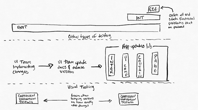
While writing Visual integration tests is possible, it really isn’t very helpful. Instead, relying on E2E tests is the best place to make visual checks because they show the entire output of a system rather than internal components in isolated environments that don’t reflect production. I’ve detailed how I arrived at this conclusion below.
Visual Testing a Single Component Isn’t Very Valuable
Writing tests for a single component seems the simplest to write and the easiest to validate. The problem with this approach is that a single component is often not exposed as a singularly web-accessible link and even if it was, it’s hard for that component to actually represent how it would really render in the application.
Visual Regression Testing works by taking two pictures and comparing them using a clever library that only fails if an acceptable threshold has been exceeded. The library I like using is americanexpress/jest-image-snapshot which navigates a browser to a deployed webpage and takes screenshots to generate the two images.
For more details on the specifics of Visual Testing tooling you can reference either of these great articles:
The take-away is you’ll need to expose single components in a way that they can be tested from a url. This can be done by exporting every component as a static html page or by routing to every component (and every variant of that component) explicitly.
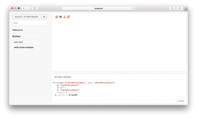
Enter Storybook, a great tool for visually working with the components within your application. It has high praise for enabling users to test components in isolation and help building confidence in components. I think it’s an awesome tool to help developers accelerate their ability to ship user interfaces.
While Storybook builds to an environment where Visual Tests can be performed via URLs, it doesn’t actually represent the application. Building components in Storybook uses a separate build then the rest of the application and doesn’t usually import all of the CSS or environment conditions where these components are actually used.
It’s a nice integration sandbox, but it doesn’t really match the reality these components are under. How confident can we be reusing one of these components in a new environment or in a way that we don’t have an existing example for in Storybook. How confident can we be that some global CSS or other dependencies don’t interfere with the visual functionality of the components being used in Storybook.
Fighting to Test a Single Component
Taking all of this in, one of my first attempts to get Visual Tests working using the correct build was to add a router for each of the components under test. I exported the testing components directly from the test folders and would include them using unique names with their own routes.
export const FORM_HEADING = "/FormHeading"
export const FORM_POPULATED = "/FormHeading/Populated"

export const routeComponents = [
  { route: FORM_HEADING, component: FormHeading },
  {
    route: FORM_POPULATED,
    component: () => (
      <FormHeading title="Test" description="Test" updateHeading={() => {}} />
    ),
  },
]
The upside of this approach was that I could use the production build to output an application that only contained routes to test components to represent as close to what production looked like as possible.
// switching out the root app for my test one on a flag
const root = document.getElementById("root")
if (process.env.REACT_APP_IS_TEST === "true") {
  ReactDOM.render(<TestApp />, root)
} else {
  ReactDOM.render(<App />, root)
}
I got the Visual Testing library working with some simple tests on my test routes. It was really great seeing the tests pass and fail as I added padding or changed the color of different components.
const config = { route: FORM_HEADING, component: FormHeading };

it(config.FORM_HEADING, async () => {
  // browser is a puppeteer.launch() browser
  const page = await browser.newPage();
  await page.goto(`http://localhost:3000${config.FORM_HEADING}`);
  const image = await page.screenshot();

  (expect(image) as any).toMatchImageSnapshot({
    customSnapshotIdentifier: formatRouteAsSnapshotName(config.FORM_HEADING)
  });
});
However, when I tried to integrate the new testing into my regular CircleCI build I ran into problems. The build would consistently fail and the screenshots being exported showed that there was some small padding issues inconsistent with my local environment.
After a bit of research I determined this was due to the CircleCI running a different browser than the one I have locally. The common solution seems to be that you run your testing browser in a Docker container. I attempted this with limited success and it made me rethink my attempt.
At this point I’ve created a new router and new components referenced in that router for each of my tests. Hardly a low impact change to the project. Bringing in Docker as a requirement for anyone to contribute to the library started tipping things over the edge. For more details of how I started looking into this, this was my source: Visual Regression Testing - Gideon Pyzer.
Visual Regression Testing Should Be An E2E Concern
I discovered that Visual Regression Testing should happen at the very end of the build process when your entire system is now deployed and integrating with other services. If I were to do Visual Regression Testing on the internals of a UI Library, it wouldn’t help me understand if I broke something for a consumer. It would tell me if something internal broke and not much more. Maybe that impacts the outcome of my library, but maybe not.
If your testing requires an environment that should reflect the outcomes of a system, then it should just run in a Pull Request (PR) environment. It should be an integration environment in order to guarantee that the outcome of a web application is successful. Websites normally run as exposed from servers and thus the most valid place to run tests on them is on an environment configured the same as one deployed to production.
Finding out that Visual Testing required having a consistent way to build a production environment was a surprise to me and led me to spend a lot of time working with CircleCI and my build configuration. While this wasn’t time spent working directly on my tests it did highlight just how limited my existing environments were. It makes even more sense why these integration environments are so important after working through this.
While Visual Tests can be integrated into an E2E environment there are still quite a few issues with running your own tests. For starters, storing all of the images for tests is small when you start but quickly grows to a point where it’s painful to work with the repository. It can also be difficult to keep things up to date and let non-developers review/approve changes to the product as changes are made.
The one that seems to have the best documentation, integrations support and pricing options is currently Percy. It works great with Cypress, an awesome E2E tool, and has a lot of other integrations into frameworks. They store everything on site, provide a great UI for reviews/approvals, and they even run all of their tests in parallel across all of the latest browsers in multiple resolutions.
Better testing leads to spending more time on the valuable things. Manual testing across the combination of browsers and devices is challenging to ensure a consistent UI is being delivered to all of the users of a system. Visual Tests help by providing confidence that you can see, review, and approve.


